
2016 Addys Judges’ Choice: Love at First Sight
Our American Advertising Awards judges spent Saturday, January 16 carefully looking at more than 500 professional entries and nearly 50 student entries submitted this year, and while they had great things to say about all the work, there were a few that made them say “That’s the one.”
Katherine O’Brien:
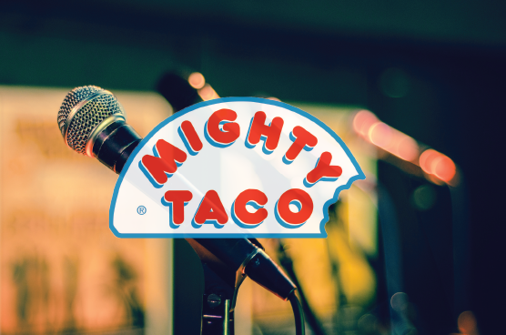
Mighty Taco Siri-Us Radio, McCandless Marketing & Media
I chose the Siri-Us spot for Mighty Taco because it’s simply great radio. It did everything right, from featuring a unique audio technique to focusing on a simple, relatable problem to solving it with the product in a way that feels authentic. This spot was funny, catchy and resulted in all of the judges hitting Might Taco on Saturday night.
Bill Starkey:
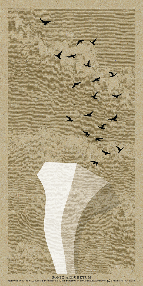
Andrew Bird “Sonic Arboretum” Poster, White Bicycle
Sometimes something just reaches from the page, or the screen, or the wall, and grabs you and won’t let you go. Looking back at this judging experience, this poster was that piece for me. As soon as I saw it, I absolutely knew I wouldn’t forget it.
I had no idea what this exhibition was, but I instantly wanted to know.
(And I found out right after we finished judging—thanks Google). Moreover, I wanted to go. And that is the whole point, right?
The beauty of this poster is it did its job without words, without a joke, without a strong call to action or any of those other “advertising” things. It does it simply with how stunning it is. It stopped me with craftsmanship in the illustration, and with the exceptional detail in the printing, which both combined quietly speak volumes about this exhibition. Every detail right down to the selection of the stock made me feel what the designer intended me to feel. It starts to transcend just a piece of communication – it starts to get into the world of art promoting art.
Most of all it stopped me with calm and beauty. What a relief from our world of digital bombardment – moving images and clickbait and photoshopped everything with a life expectancy of about 6 seconds. I would gladly frame this and hang it. Hint hint.
John Howard:
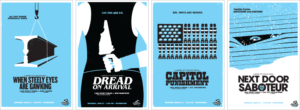
Queen City Roller Girls Travel Team Posters, Gelia
I chose the Queen City Roller Girls Lake Effect poster campaign as my Judge’s pick. An incredible well-crafted movie style poster series, it talks smack perfectly—with clever twists along the way. Individually each is fantastic, however together they sing like a perfectly conducted chorus. From the DC’s roller girls-themed American flag or Pittsburgh’s opposing faces in steel, the designer brought a unique eye and depth to his design. These four posters reflect a creative who started with a good idea and morphed it into an exceptional campaign. And, clearly, he had a blast doing it.
Kelly Butler:
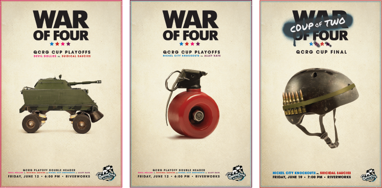
Queen City Roller Girls War Posters, Gelia
I loved the idea behind this campaign. The visuals were also very well-done and stopped me in my tracks. In short, I asked the chapter if they’d send a copy to me so I could hang it on my wall. That’s how much I liked it!